6 tips for Church Website design!
If you're planning a summer re-fresh for your Church website, you may be looking for some tips.
We love seeing the different ways churches reflect the life and culture of their church on their Church Edit website.If you're looking for some guidance on how to do this effectively, look no further! We're happy to help.
1. Keep your design minimalistic
Try to stick to a few key colours and no more than two fonts. If you use too many colours and fonts, it may begin to look messy and might not be uniform accross your whole site. Ideally, readers can focus on the content without being distracted by lots of busy colours.
2. Use a Call to action
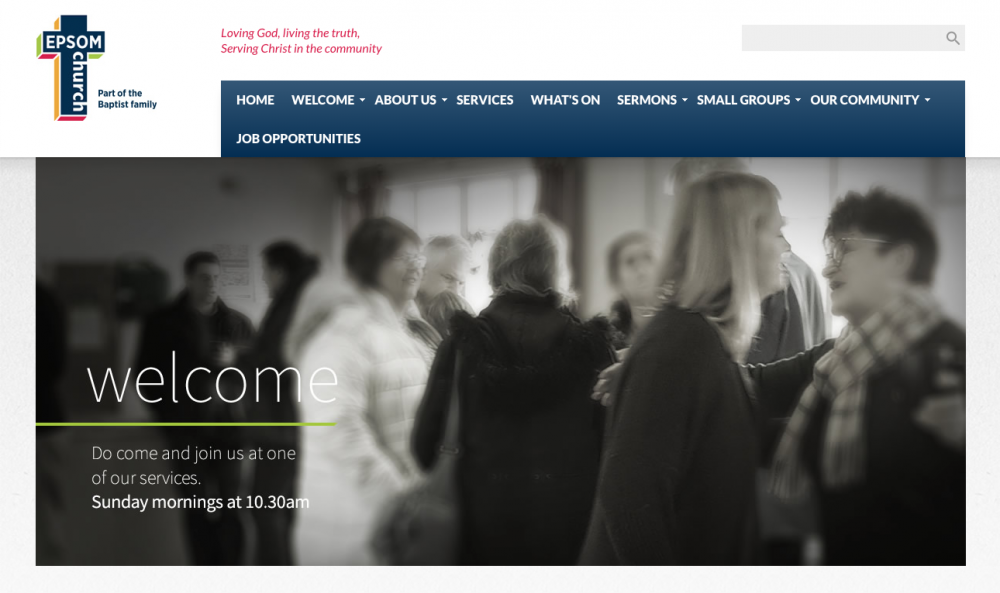
If you have too many different directions for website visitors, they may not end up where you want them to. Ultimately your website should lead people to visit or engage with your church in some way. Be sure to have a clear way that visitors can engage with you. Perhaps a very clear 'join us' button on the home page that takes visitors to information about joining you at your Sunday service. Be sure to have your church address and services times in an easily accesible place on the website! This is often what visitors will be looking for.

A great Call To Action button from a Church Edit website - St James Rowledge. It links through to Sunday Service Information
3. Keep all text concise and simple, highlight the main content of your site
Try and keep your reader's attention. We're sure you have lots of rich information and history to shout about from your church, and it's great to include that on your site! But make sure any key messages aren't missed in all of that. Perhaps have dedicated areas for longer-form text posts, and keep the front page and any key areas simple.
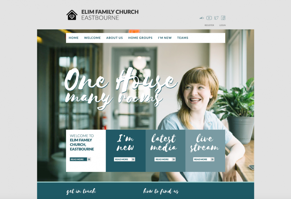
4. Use pictures of people from your church
Stock images are really helpful! we get it, we use them too. However when people are looking for information about your church it will be very helpful if they can see pictures that reflect the real life of your church. After all, a picture is worth a thousand words! If there is anyone at your church who is good with a camera, maybe you could ask them to bring it along this Sunday and snap some pictures. Don't forget to get permission to have people from your congregation on your website.
Here is one Church Edit site with photos throughout that reflect church life.
5. Make sure your site is mobile friendly
A lot of people may access your site from their phone and ideally it will be as easy as looking on a computer for the information they are searching for. All Church Edit sites have a mobile friendly version, however there are things you can do to make the site easier to use on a smaller device. For instance, make sure information is clear and easy to find when looking on a mobile and make sure buttons are big and easy to press on a mobile.
6. Don't be scared of space!
It can be tempting to utilise all of the space on your church website, however it can make it quite busy. Always remember that less is more! If there is space on your site, it will direct visitor's attention to the important messages.
If you are looking for information about accessibility while you are re-designing, take a look at our other articles:
Improving your church website accesibility - Part One
A sight loss friendly church; Improving your church website accessibility - Part Two.